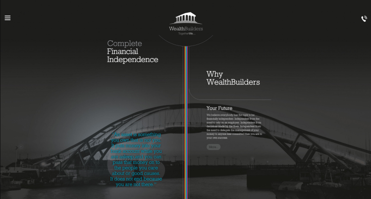
The most Challenging Responsive Web development project was probably this "mind map" design for WealthBuilders.
Mind map was the client's terminology for their programme represented on screen by a multicoloured ribbon.
You can see the website archived here as they have updated their website since.

This is the start of the mind map, which takes you on a journey down the page.
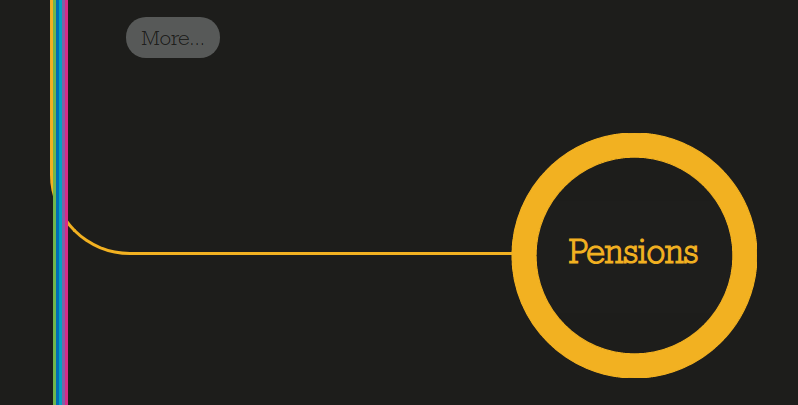
As you scroll down, the individual lines break away from the main ribbon to form the section headers, which have been colour coded to match their lines.

The lines alternate between leading off to the left and right of the main ribbon, which is positioned centrally on the page.

Well, that's for the desktop.
This is where things became even trickier, how to make it work for smaller devices?

The main ribbon of the mind map moved over to the left of the screen and all breakout sections were positioned on the right side of the screen.
Now we didn't have the comfort of being in a centralised column (the Bootstrap container) with a known width at each breakpoint, everything had to scale/shrink for all widths.
Also, everything had to adapt vertically because the content could be any length and the 'More' button was an accordion with further content which would expand to an unknown height.
We started developing this quite a while ago, back in 2015 and Responsive Web Design was fairly new at the time, particularly in the UK.
The designers certainly set a very tricky challenge to say the least, but we made it work and this project is something I'm particularly proud of due to the technical challenges involved.
Although I was responsible for building the site, I had some fantastic support from my colleague and fellow developer who assisted with problem solving, thanks Carl!


